The Development and story of the game

Simone Guggiari - September 7th, 2019
The following is a short blog post detailing the development of the game rainforest, Inc. The game was developed in August 2018 as part of the Ludum Dare 42, an online game jam that challenges game developers to create a game following a particular theme in 48 or 72 hours.
I thought it would be fun documenting what went into it, my schedule during the jam, some tricks used to develop the game and what happened afterward.
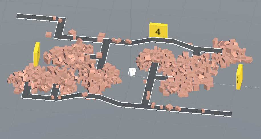
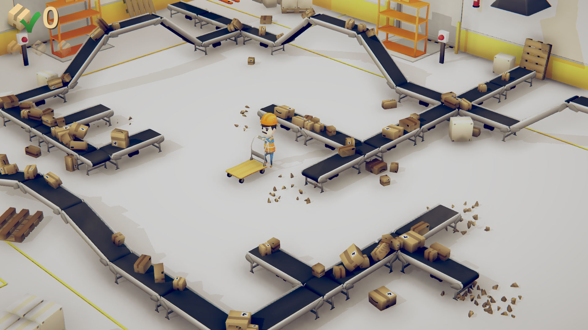
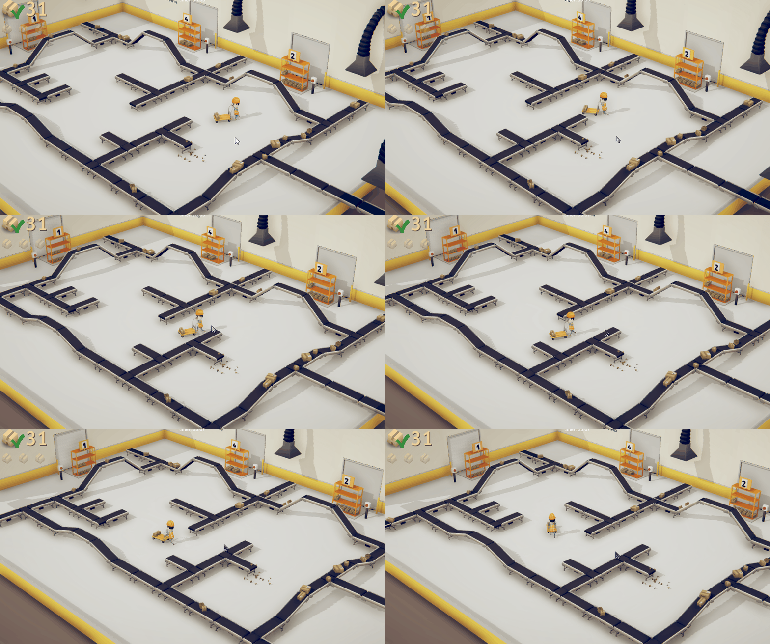
The following video and screenshot show the final result: you can play it directly in the browser over at itch.io or download it for free for Windows, Mac, Linux, and Android.
Day 0 - Theme announcement
In Europe, Ludum Dare started at 12:00 AM. Mike Kasprzak, the organizer, tweeted this picture, indicating the start of the jam and the theme, which was: Running out of space.
The theme for Ludum Dare 42 is: Running out of space. #LDJAM pic.twitter.com/0OP6Z6WnJG
— Ludum Dare (@ludumdare) August 10, 2018
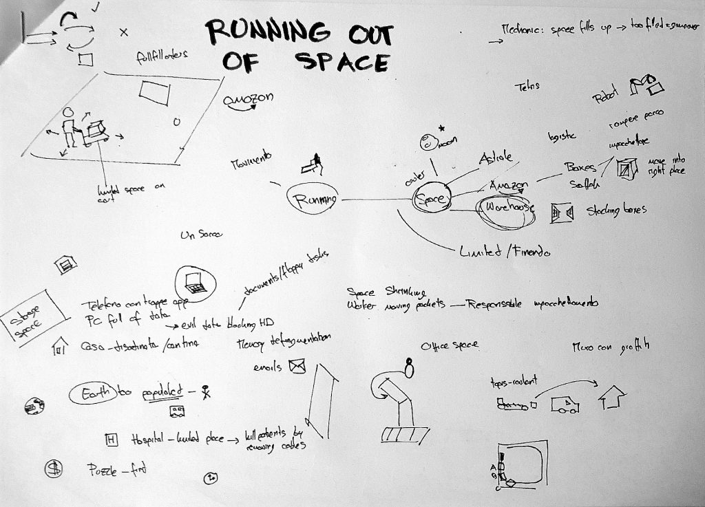
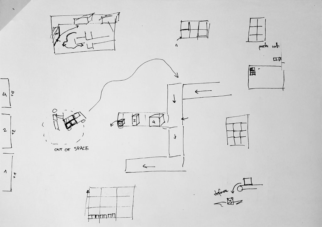
My teammate and I immediately jumped into a multiple-hours-long brainstorming, trying to come up with a fun and original idea for the jam. These are some of the sketches done during the brainstorm. Some already depict the main game mechanic with the worker running around and conveyors transporting the parcels.
Day 1 - prototype and gameplay
The goal of day 1 was to finalize the prototype idea and have something playable by the end of the day.
The next morning, after some more brainstorming, and possibly due to the suggestive photo tweeted, my teammate and I settled on the idea. We would develop a game set in a warehouse in which the protagonist should run around and sort the boxes by size, to avoid running out of space on the shelves. A quick paper/cardboard prototype was made to test out the mechanics roughly .
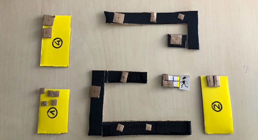
The worker would have a small cart with only 6 slots, that could be filled by packages of different sizes: either 1, 2 or 4 blocks. It also further reinforced the theme of running out of space on the cart as well – each package needed to go in the appropriate shelf, based on size. The boxes would spawn and be carried around the warehouse by conveyor belts, at the end of which they would fall on the ground and break. This would cause game-over since the player wasn’t fast enough to deliver them all.
I immediately jumped into Unity and started programming the conveyors transporting the packages around with physics. After a few hours of work, something was moving on the screen.
The conveyors check for collision with the boxes. Upon detection, they apply a force to the packages in their direction of heading.
One of the significant challenges was how to create forks in the conveyor layout, to make the game more interesting. I wanted that at conveyor intersections packages could go one of two ways. This feat was achieved with unique corner conveyor pieces that change their force direction randomly with a certain probability upon detecting a new package. By tweaking the probabilities, one can create different densities of packages moving on the lanes.
I then worked on implementing a simple character controller that could move around the warehouse with a small cart. Packages could be collected and put on the cart if there was enough space and placed in the appropriate shelf by size when getting close enough.
To take breaks from coding, I would relax by modeling some props for the game. I started by modeling boxes of different sizes, a cart, conveyors, and some rough shelves.
The following is the result at the end of day 1:
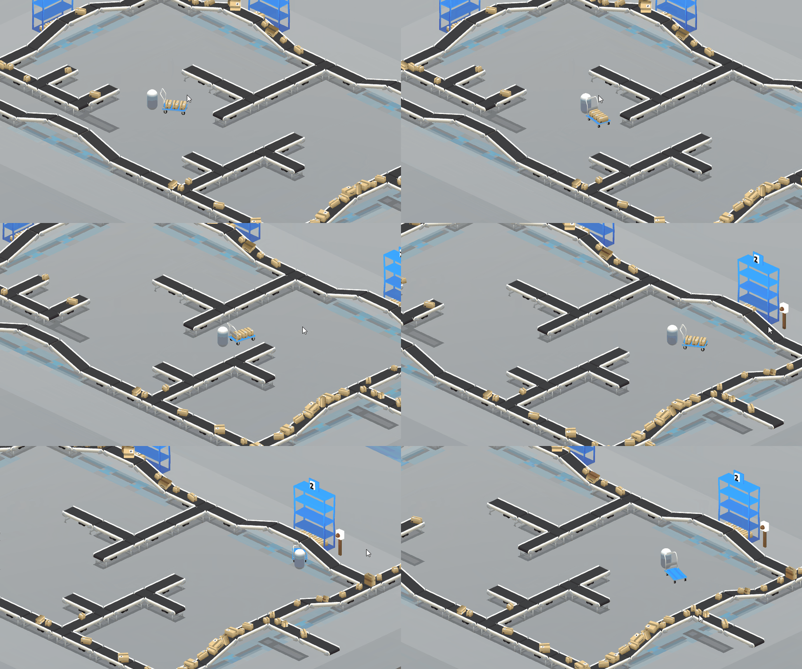
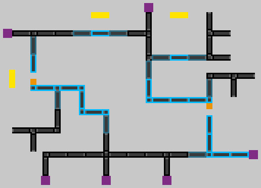
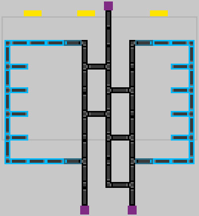
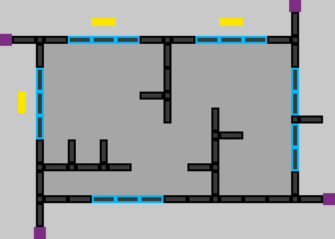
You can also see the map layout looks different from the early prototype. I designed a rough level on paper and then finalized how I wanted the conveyors to be laid out in Photoshop using pixels as a unit. Doing so sped up the process, rather than work directly into Unity. In the following image, each conveyor is represented by a pixel pattern, to ensure the result matches up. The single pieces are also shown below (on the right):
- the purple square is a box spawner
- the yellow rectangle is a shelf
- the black rectangles are ordinary conveyors at the ground level
- light-blue rectangles are elevated conveyors to allow the player to move below them
- dark-blue conveyors are inclined conveyors that connect the previous two types
There are also different types of s small conveyors, depending on the type of junction. The gray pixels indicate in which direction the boxes move.
You can see the map “glued” on the ground in the picture above to aid in the placement of the different conveyors.

With all of this in place, I decided to wrap it up for day one and get some rest.
Day 2 - graphics and animations
The goal of day 2 was to have the game with most features and assets implemented, to resemble what the final game would be.
I decided that I needed to start working on creating a few more models, especially the main character.
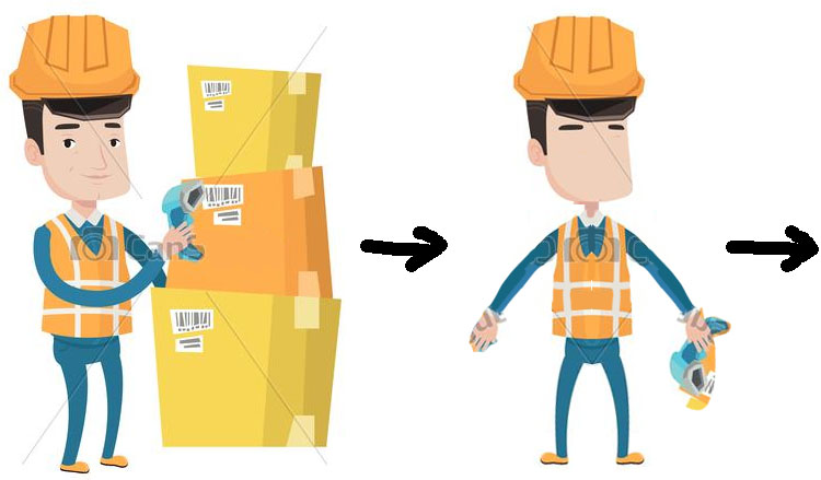
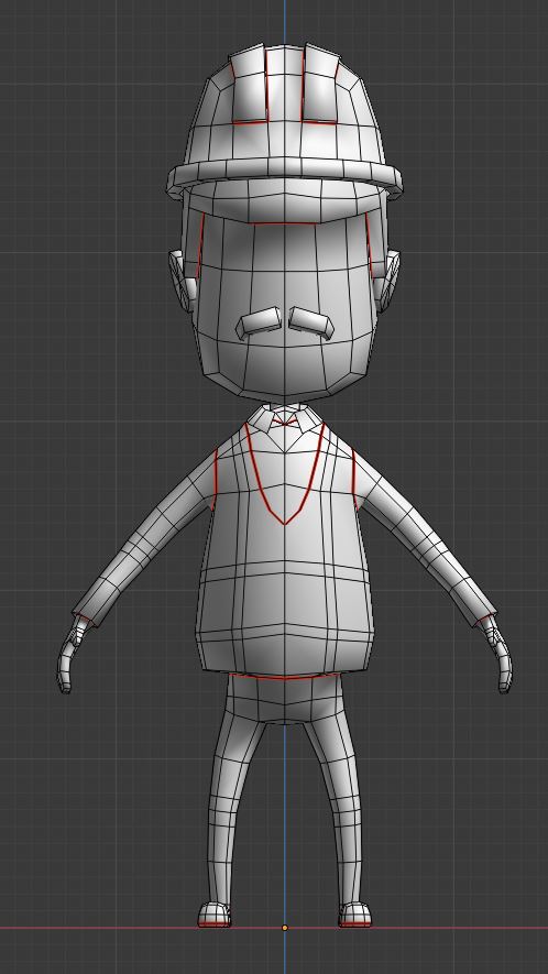
I found online a reference of a worker that suited pretty well was I was going for. I modified it a little in Photoshop to turn the reference into a somewhat “T-pose” to aid modeling. I usually find it easier to model by using references (duh), and since I’m not that good at drawing, I typically reference something found online. I imported the reference in Blender and started modeling it:
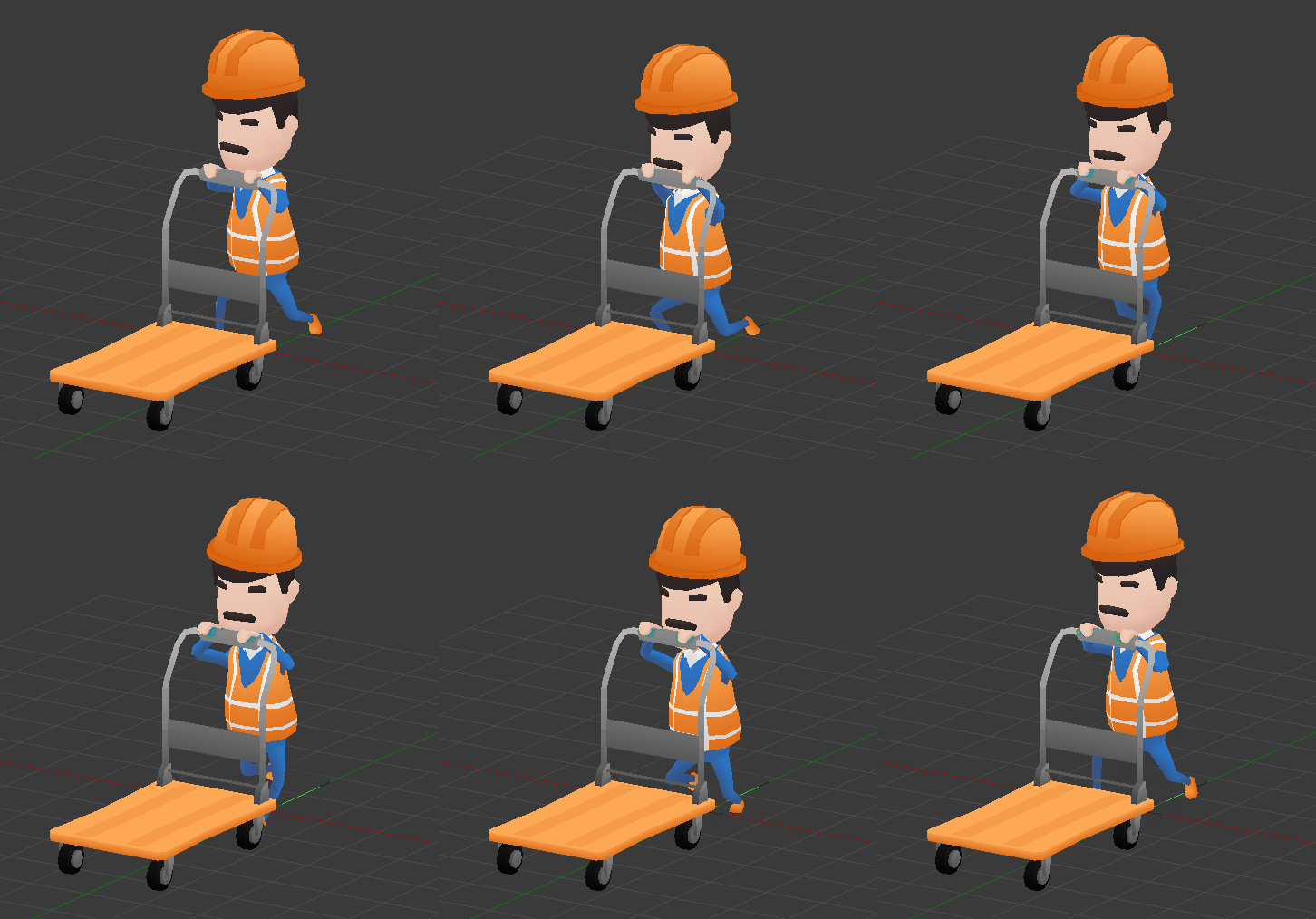
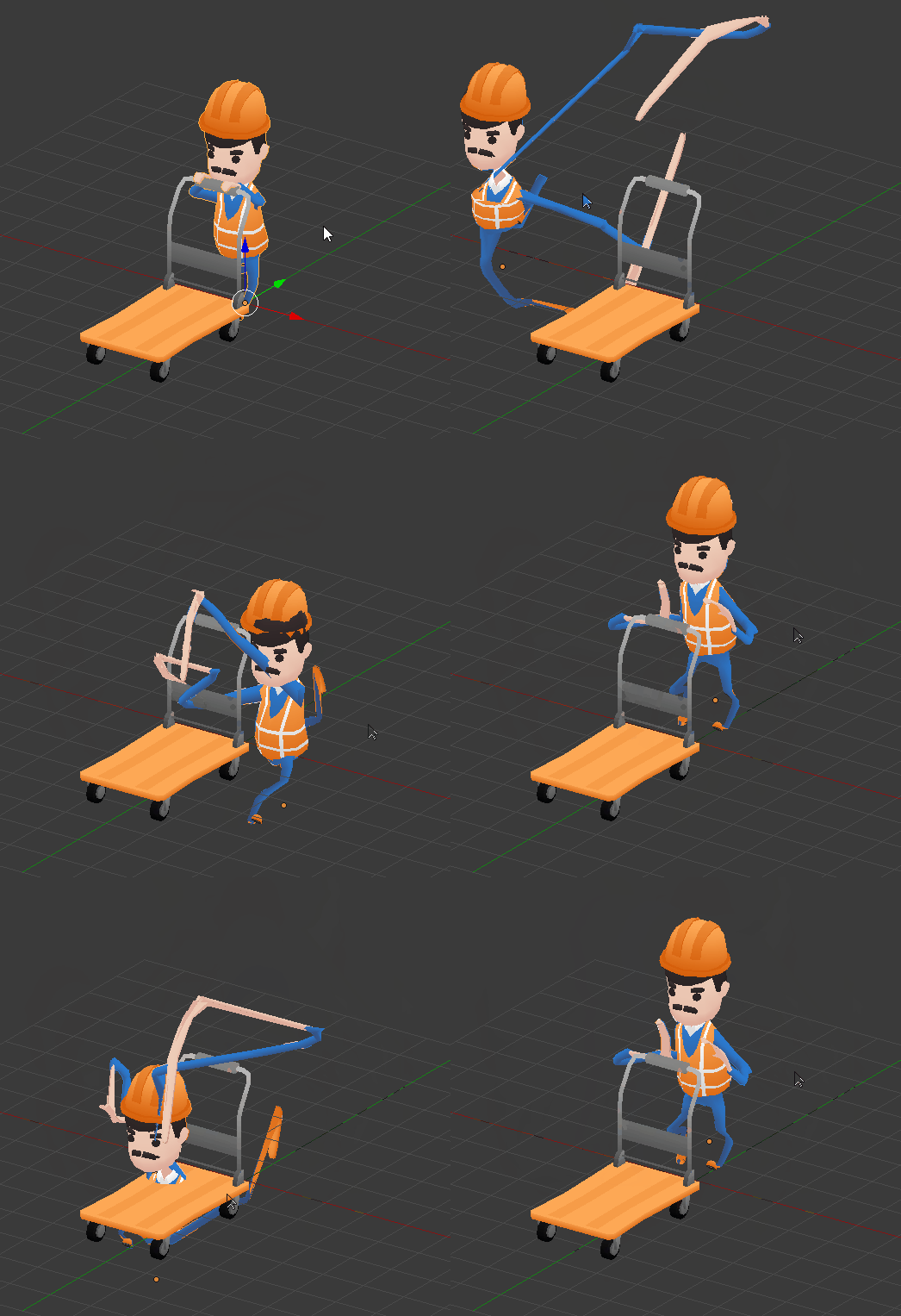
Next was texturing, rigging, and animating: the basic animation was a run cycle with the cart. You can see the animation of the character once rigged below, as well as some fun with the skinning matrices:
Next, several other meshes were needed. The previous day I had already modeled boxes, conveyors, shelves and a cart, but I still needed
- environment (floor, walls, doors)
- doors and buttons
- funnel for packages to arrive
- props (boxes, barrel, pallet, other carts)
- other small props (extinguisher, exit sign)
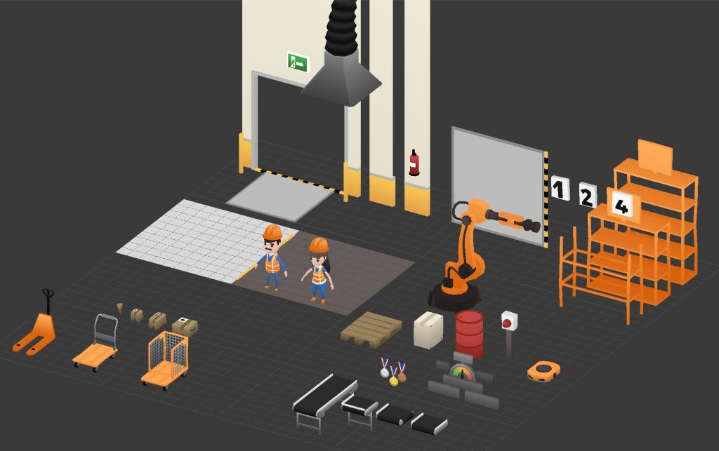
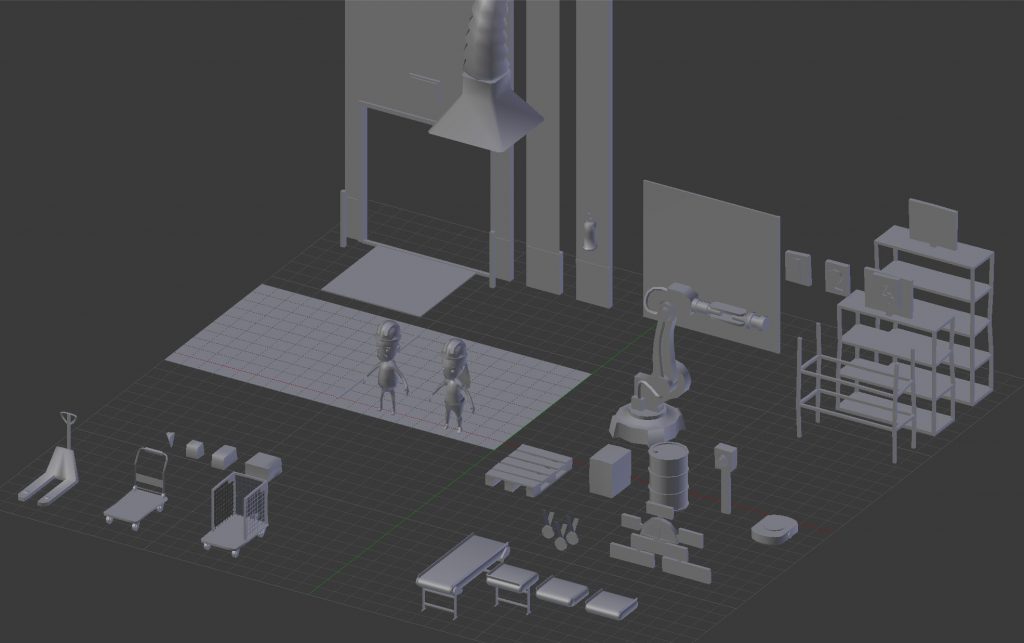
Modeling all this took quite a while, although the models are mostly low-poly. You can see all the models that went into the final game in this interactive 3D visualization. There are also a few additional models that I created after the jam completed as I wanted to expand the game. These include
- female worker character (Jane)
- robotic arm
- robot shelf-move
- medals
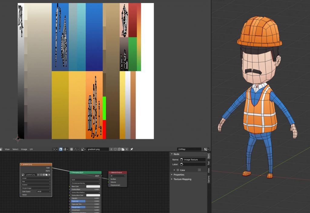
To speed up the process of modeling, I use a single gradient texture. Every model in the game uses this single 128×128 image:

Most of the gradients in the picture aren’t used and are there due to iterations on the palette. Out of the 18 gradients in the texture, only 9 are used. The main character uses 5 gradients, 2 of which are the dominant ones (blue-orange) and 3 are used for details (skin, hair, shirt).
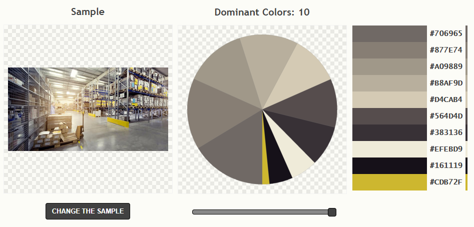
To generate the palette, I find some image whose palette I like, and then run it into a software that finds the dominant colors (simple k-neighbors clustering). I can then create simple gradients using these colors.
Once I finished working in Blender, I then worked on importing the models in Unity.
I also worked on setting up the level, shading, materials, camera, and basic UI and HUD to show the state of the game and the score.
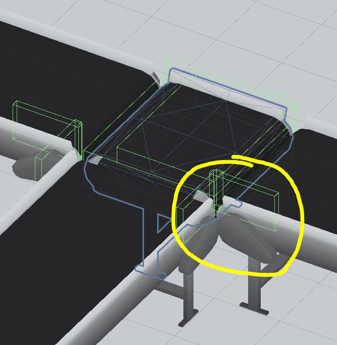
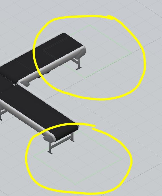
Afterward, I started adding logic for boxes breaking and game-over condition. One challenge was that boxes would sometimes fall out of the conveyor when they were not supposed to. For example, because another box was in the way and not necessarily because they reached the end of the conveyor. This would mark the player as having lost a box, which was pretty frustrating and unfair.
I tried solving the problem by adding invisible colliders to the conveyors. That somewhat helped and reduced the number of boxes falling out, but it could still happen at certain moments since the physics engine controlled them.
A quick hack which was however very effective was only to detect boxes falling at specific places below the end of conveyors. This ensured that only the boxes falling out at the right place were marked as lost.
If you play the game and get to the more hectic stages, you can still see boxes falling out in the background sporadically. Oh well, that’s what probably happens when I don’t get my order.
I figured that having an online leaderboard would be a pretty cool feature. I, therefore, started to work on a rudimentary system that would allow to send tuples of (name, score, time) to a server and retrieve the top results as a simple text string. The back-end is a simple MySQL database that can be accessed by a PHP script that either submits a new score or retrieves and returns the sorted entries.
It allowed having a scoreboard feature once you reach game over, showcasing the score of the best players, as well as yours if you make into it. Unfortunately, I forgot to check if the name inserted is null, so in that case, the score becomes the name and the amount of time lived becomes the score, and time remains 0. That’s why the “top” players all have a time of 0 seconds.
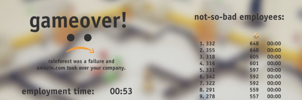
With the leaderboard in place, I decided it was time to wrap up Day 2. Below you can see the state of the game after 48h of work.
Day 3 - sound, polish and balance
The goal of day 3 was to produce audio, effects, and polish and balance the game, before publishing it.
I started by inserting the music and sound effects previously created by my teammate. I then worked on a contextual system that would display small sentences in the form of a comic bubble to give some personality to the little worker. This feature also helped the player understand what was going on.
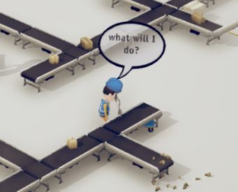
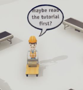
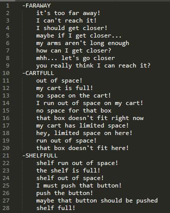
The warehouse workers are “aware” of what’s going on based on events. There are a total of 11 different events, such as FARAWAY (trying to collect a parcel out of range), CARTFULL (no more space on the cart), BOXPICKUP, NOTRIGHTFIT, RANDOMTHOUGHT and more. The game triggers these events, and each worker can then independently decide to talk with a certain probability and pick one of the appropriate sentences in that category. It also makes sure the line wasn’t recently spoken by a coworker.
All the possible sentences (around 100) are in a simple text file parsed at the beginning, sorted by category.
I also worked on a simple introductory menu in which the player could select the desired difficulty.
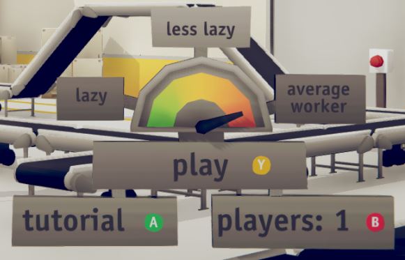
Some additional mechanics, such as blinking buttons to press when shelves are full were also implemented.
The rest of the time was spent polishing, adding props to the level, creating simple animations such as the player waving hello at the beginning. I also spent time creating icons and banners, tweaking the difficulty curve, and getting ready to publish.
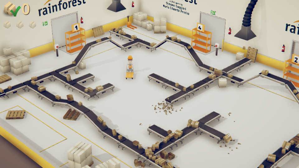
The following is the state of the game at the end of day 3 when it was finally submitted to the game jam.
jam Results
This was the first jam I completed (I had tried twice in the past but never managed to submit anything), and I was extremely pleased with the result. I was surprised by how much one can get done in such a short amount of time. I was proud of myself for finishing a project and being able to showcase it rather than stopping because something isn’t working as one wish it would.
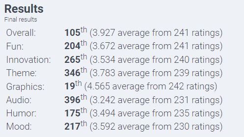
The response from the Ludum Dare community was overwhelming and incredible. Over 230 developers played and rated the game in the 3 weeks following the event, making it the 4th most rated game!
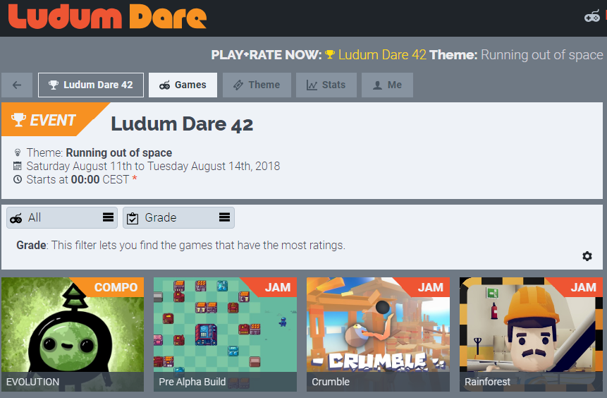
Several thousand people were playing our game directly in the browser at itch.io. We were getting thousands of impressions and several hundred new players every day.
The quality of feedback and comments from the community was also incredibly useful. It helped pinpoint areas of the game that needed improvements (mostly the controllers, a bit clunky and some unintuitive mechanics, such as small packet size). The community also suggested new and fun ideas on how to tweak the game, as well as new mechanics and modes to expand it.
I was also extremely pleased with the rating received, scoring the game close to 4/5 stars and 105th overall. I was also astonished for the placement in graphics since I’m far from an artist (actually a programmer ). I should probably put some more effort next time for Innovation, Theme, and Audio.
It was also amusing while at the same time somewhat weird seeing YouTubers and streamers post videos of them playing your game. It gives you a perspective into how others play your game, and it allows you to understand where your design could have been better, and what turned out well.
Final game
After the jam completed, I worked a few more days on the game, mostly fixing some bugs that came up as feedback of people playing. I also refactored some of the classes of the game to have a better organized and structured code.
4 player co-op mode
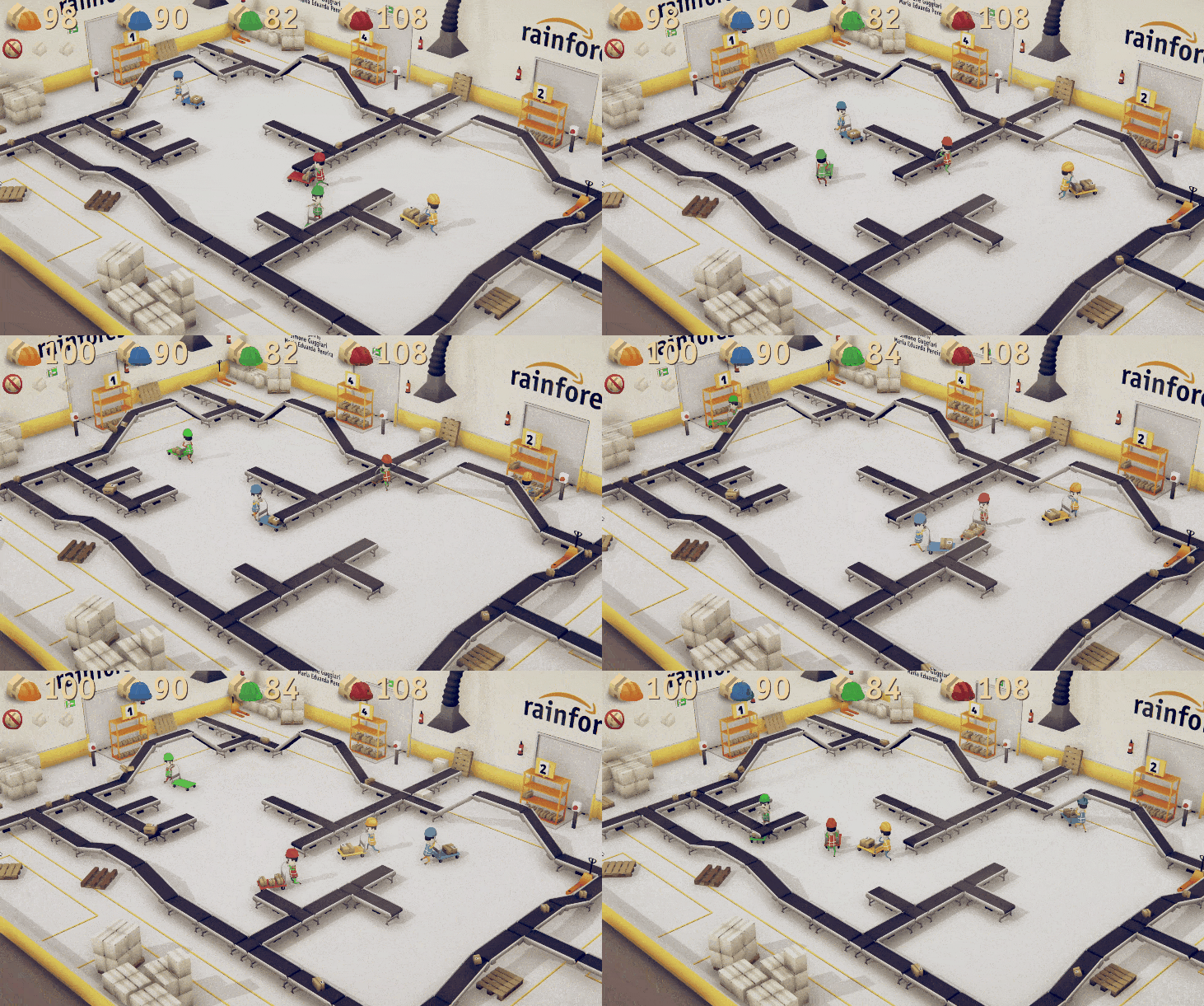
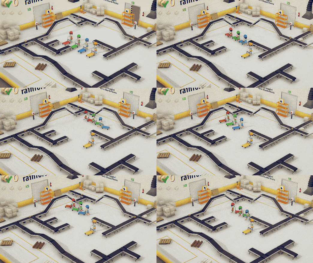
I also wanted to turn the game into a cooperating experience, and once the code was cleaned up a bit, it was pretty straightforward. It’s now possible to play the game with 1-4 players. Joe (the original warehouse worker) got three additional coworkers, each with its colored uniform:

Additional maps
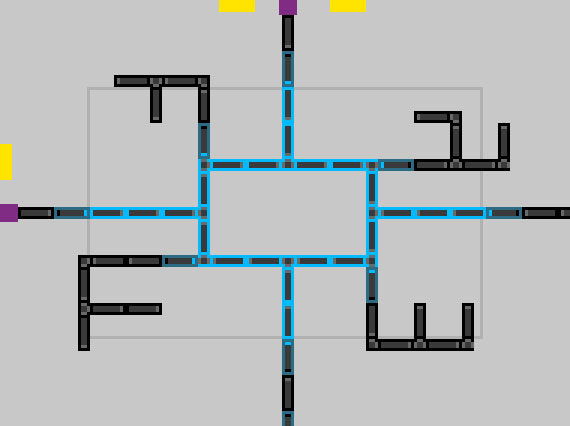
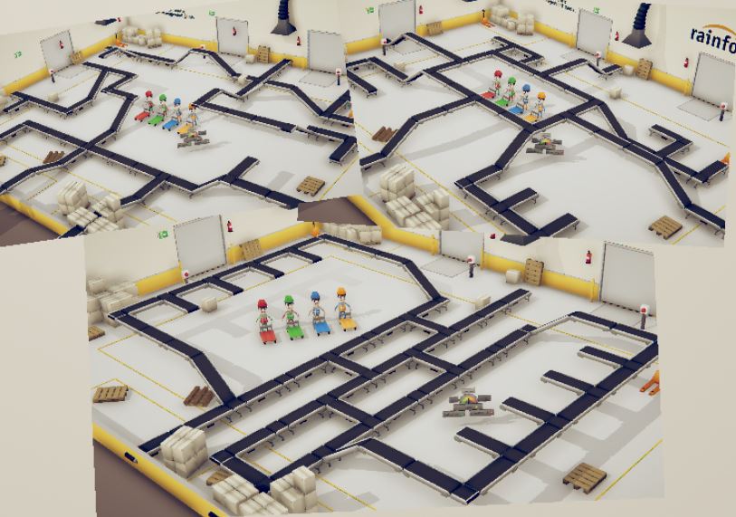
We also worked on implementing a few new maps to spice up the gameplay. With the system previously described, it was pretty straightforward to design the map as a pixelated image in Photoshop. A small script would then place and set up the appropriate prefabs in Unity automatically:
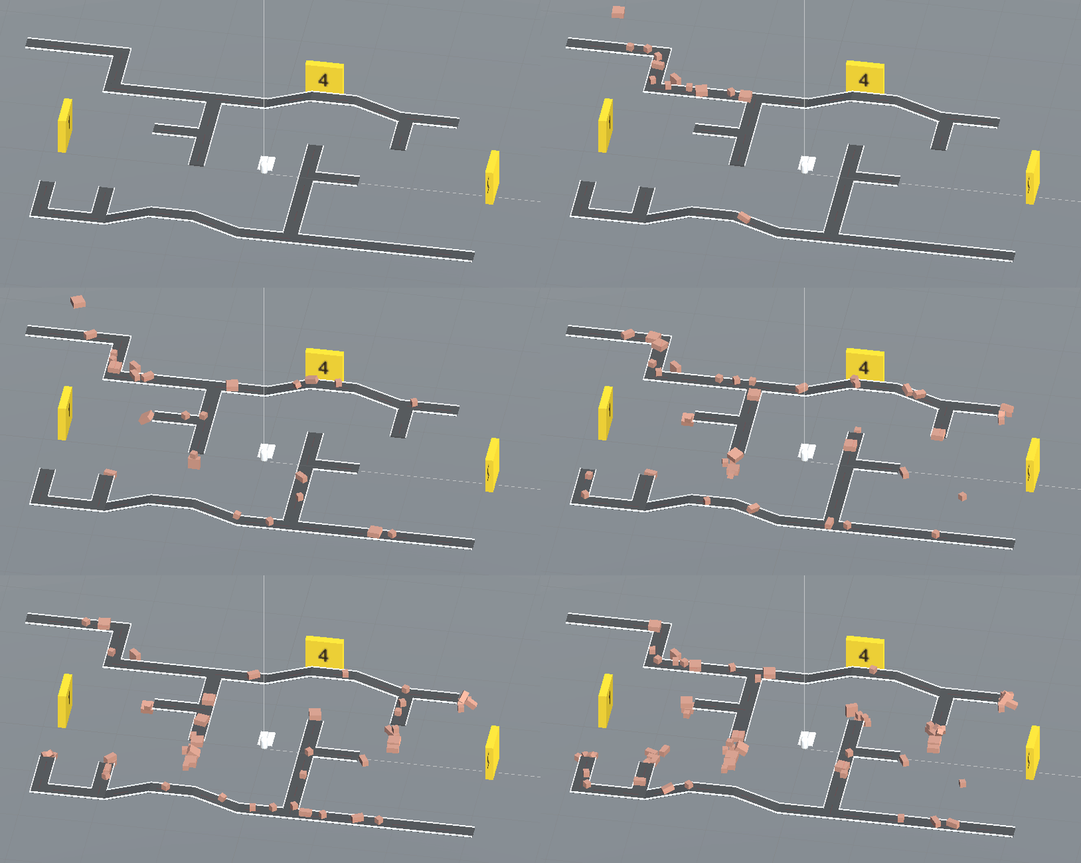
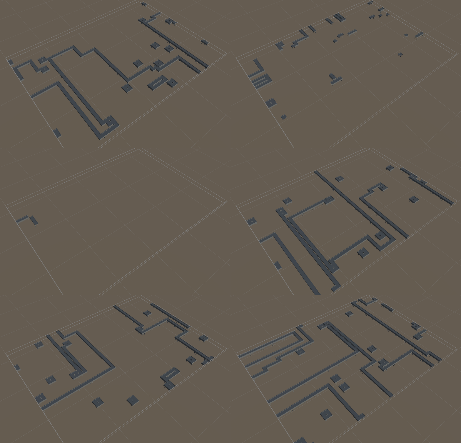
I also worked on a system that could procedurally generate maps, by using the Wave Function Collapse algorithm. I talk about this algorithm in-depth in one of my other posts. You can see below some of the results. Some work still need to be done to ensure the generated levels are playable and fun.
Exhibitions
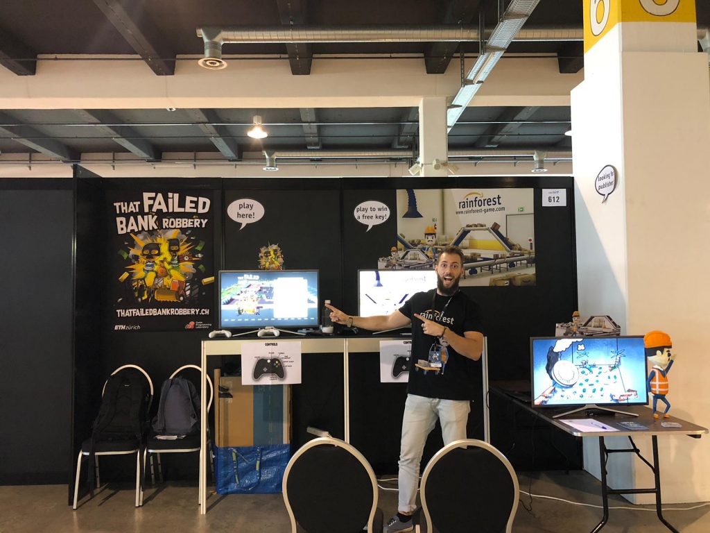
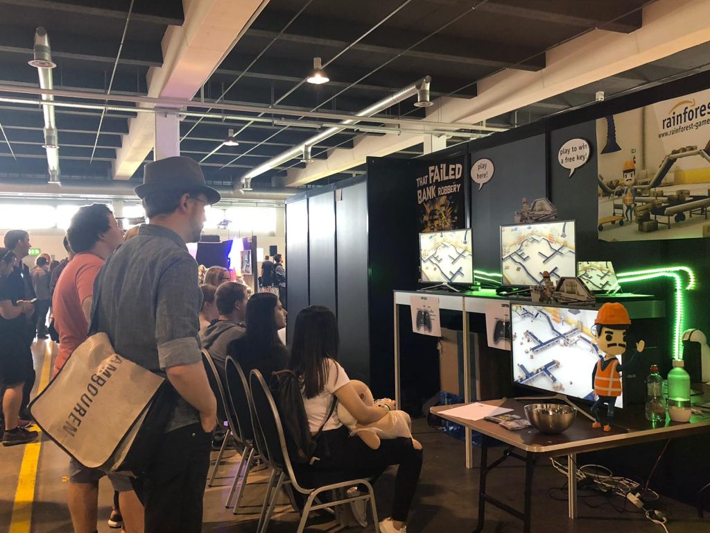
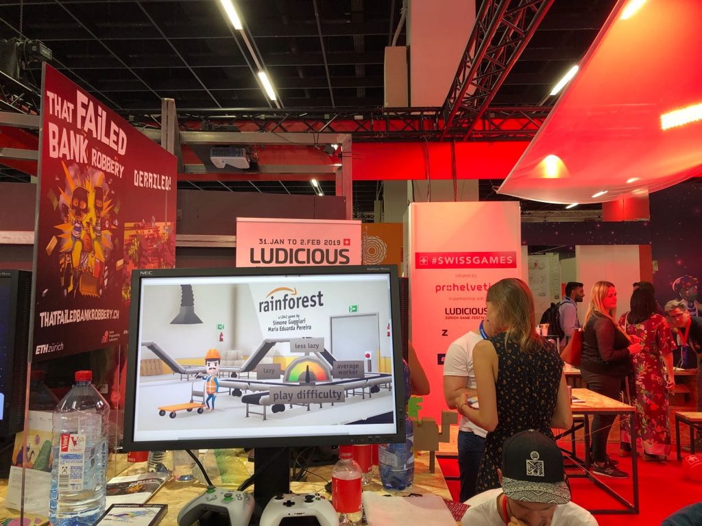
We were invited to showcase our game at the Zurich Game Show 18, Switzerland’s biggest game exhibition. It was extremely fun to see people play the game and see kids, especially have a lot of fun with it.
People started asking if the game was already available and if they could buy it, so we began selling keys to the game. It was the first time I had ever sold anything I had programmed and created, and it was a very humbling experience.
There were also some small interviews which were also pretty fun.
Time Management
Before the jam started, I planned out in detail how I wanted to be spending my time during the 3 days, and what I wanted to achieve by what time.
I split everything that we had to do into a few categories:
- Idea, prototype: coming up with an idea for the game, find references, and write a short document listing everything I needed to implement and create
- Code: implementing all the features in the game
- Assets: split by images and textures, 3D models (characters and environment), animations, and audio (music, effects, speech).
- Other: preparing the build, tutorial, text, testing, and balancing the game.
I also split the development into 5 milestones, described below:
- 0 – Idea/prototype: have a clear idea of what we want to create
- 1 – Functional target: have a basic rough game skeleton in which the main mechanic is implemented
- 2 – Low target: add missing game features, as well as win/lose conditions.
- 3 – Desired target: create and integrate graphics assets.
- 4 – High target: add animation, audio, additional features.
- 5 – Extra target: add effects, polish, and balance the game.
I set deadlines and allocated hours for each in advance.
- Day 1 should have seen progress up to at least the low target, with focus on game mechanics implementation.
- Day 2 was mostly for assets creation, as well as their integration and additional features.
- Day 3 was set aside for polish, balance, effects, and publishing, as well as many unforeseen tasks.
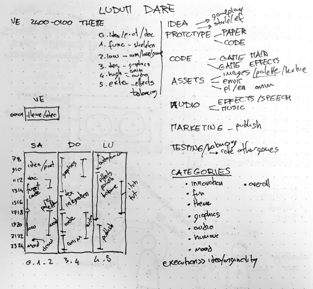
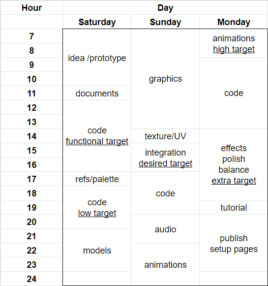
Although the schedule deviated somewhat from what I had initially planned, having thought about how to manage the time helped keep the project on schedule. It also helped decide which features were feasible in the 72 hours of the jam.
Conclusion
I hope this devlog was interesting if you came this far, and that maybe you learned a thing or two.
If you still haven’t checked out the game, give it a go:
Thanks for reading. Cheers! 😄
